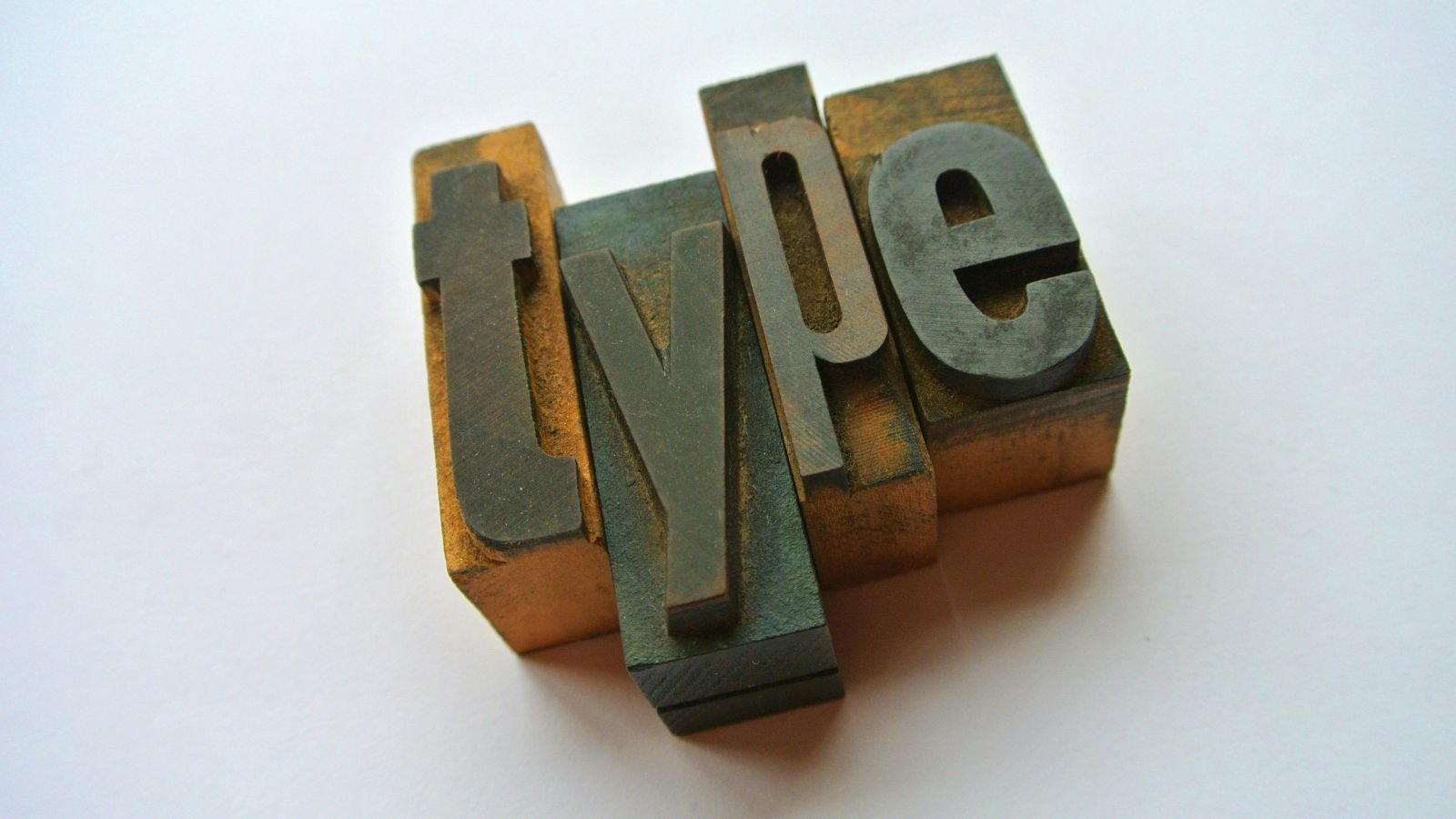
If you’ve ever called Arial or Times New Roman a “font,” you’re in good company. Even many designers casually mix up these terms. While they are closely related, each has a distinct meaning.
A typeface is the overall design of a set of characters. Think of it as a family’s visual identity. For example, Helvetica, Garamond, and Times New Roman are typefaces.
A font is a specific variation within that typeface. Helvetica Bold Italic at 12 points is a font, while Helvetica Regular at 16 points is another. Historically, in the era of metal printing, each size and style required a separate set of physical type, making every combination a different font.
Type is the broad umbrella term for letters and characters used in printing or digital publishing. Designers might say, “The type is too small,” or “Increase the type size.” Unlike font or typeface, the word type does not refer to a particular design. It simply means text or printed characters.
Typography is the art and science of arranging type to make written language readable, clear, and visually appealing. It involves selecting typefaces, adjusting font size, line spacing (leading), letter spacing (tracking), character spacing (kerning), alignment, and hierarchy to guide the reader’s eye.
Other useful terms include serif, the small finishing strokes found on letters in typefaces like Times New Roman; sans serif, which lacks those strokes, such as Arial; weight, which describes thickness, from Light to Bold; and x-height, the height of lowercase letters like “x,” which influences readability.
Understanding these terms helps you communicate more precisely and make better design choices. Good typography is not just about choosing attractive letters. It is about ensuring that every word is effortless to read and visually engaging.